FROM SWIPE TO TAP: DESIGNING A DIGITAL METROCARD
PROBLEM
KEY INSIGHTS FROM USER RESEARCH
The Metrocard system in New York City is outdated. It is costing the city millions of dollars in maintenance and operations, while also costing riders valuable time. Many users find the machines dirty and unpleasant to use, which adds to the frustration of the experience.
The goal is to replace the current system with a modern solution that eliminates the need for physical cards. Riders should be able to purchase and use their fares digitally, so they no longer waste time or have to touch unhygienic machines.
From a business perspective, the objective is to save the city money by removing the need for MetroCard vending machines and physical card production. A fully digital system would streamline operations and reduce long-term costs.
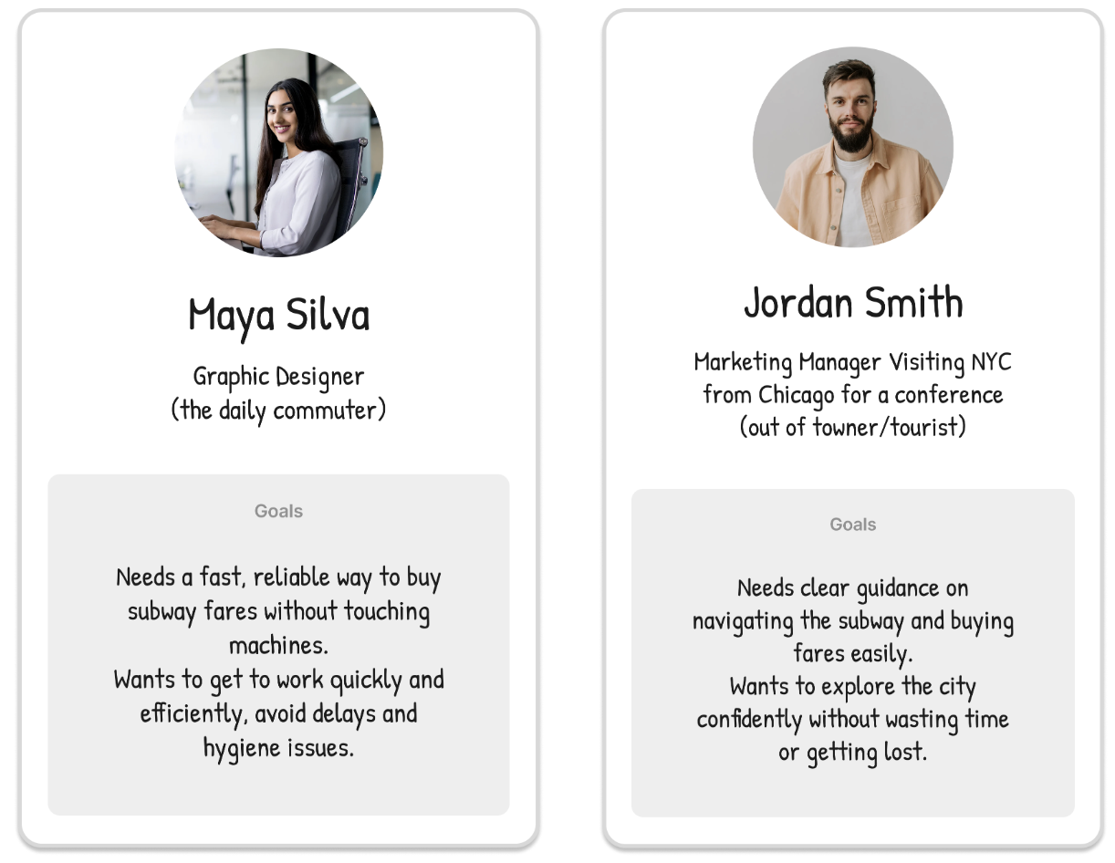
The target users include both daily subway riders and out-of-town visitors. The system must be easy and quick for both groups to understand and use. To achieve this, the solution should be available on both iOS and Android platforms, ensuring accessibility and convenience for all users.
I conducted a survey targeting individuals who have commuted to or lived in New York City. Since I live within commuting distance of NYC, I shared the survey in a local Facebook group and invited participants with relevant experience to respond. The survey was open for a short period and received 38 responses.
Users don’t want to touch anything in the subway. The word “disgusted” appeared 19 times. Negative emotions like frustrated, rushed, and confused were mentioned 52 times, far more than the 16 mentions of positive feelings of happy and easy.
Users want a quicker and easier way to buy MetroCards. Although most found it easy, 11 respondents said the process was not easy, indicating room for improvement.
PLATFORMS
iOS, Android
AREAS
Strategy, Design
ROLE
Lead Designer
Users want to use an app to buy a MetroCard. 35 out of 37 respondents said they would use an app, showing strong demand for digital convenience.
EMPLOYER
NYC Metro
APPROACH
After analyzing the survey results, I focused on creating a digital MetroCard app built around speed, simplicity, and intuitive navigation. The goal is to offer a frictionless way to buy and use subway fares without relying on outdated or unhygienic machines. The solution is designed for both daily commuters and out‑of‑town visitors, providing fast payment options and clear guidance for first‑time users. The app will be available on iOS and Android, ensuring accessibility for all riders.
PROCESS
USER PERSONAS
MOODBOARD
Research showed that both commuters and visitors struggle with key moments in the subway journey - buying fares, navigating stations, and dealing with delays.
Commuters need speed and efficiency to keep their daily routine on track.
Visitors need clarity, guidance, and reassurance in an unfamiliar system.
Despite different goals, both groups share one core need: a simple, intuitive way to pay for rides and navigate confidently.
These insights shaped my goal, to design a digital MetroCard experience that removes friction, supports riders in real time, and makes the subway feel easier for everyone.
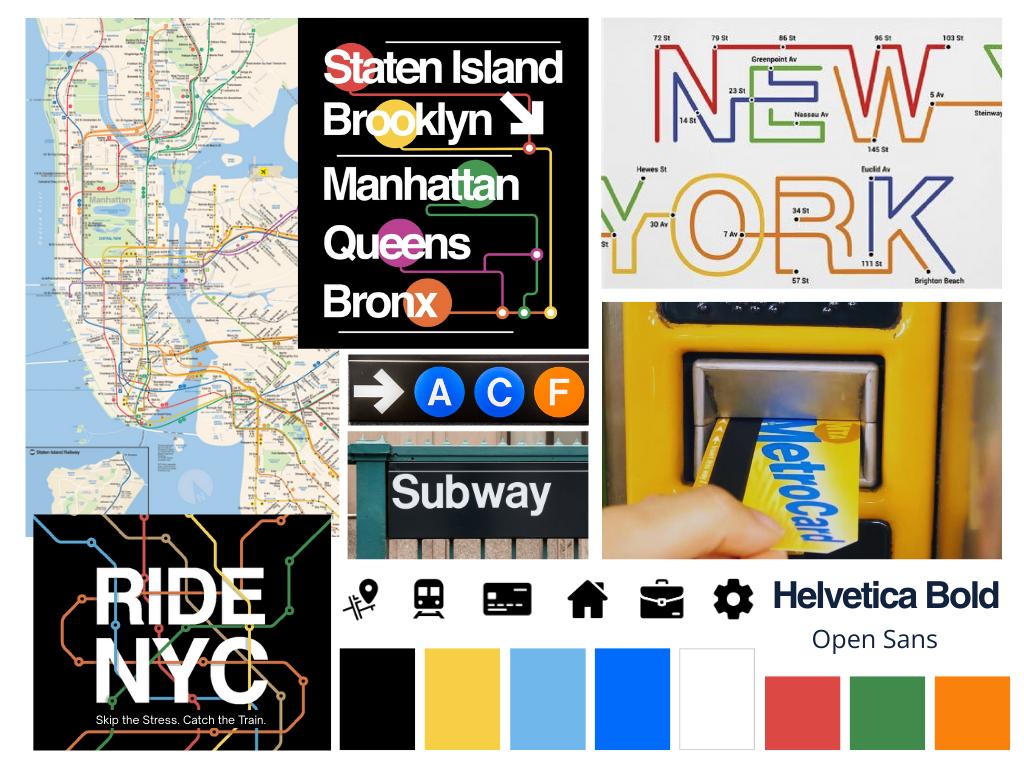
After completing my research, I built a moodboard to set the visual direction for the UI. My fashion design background helps me quickly define tone and aesthetic through curated visual references.
Goals
Maintain a clear New York City feel
Modernize and simplify the visual language
Use recognizable transit design cues
Key Decisions
Subway Map Elements: Used as a core visual anchor to reinforce NYC identity.
Typography – Helvetica: Chosen for its close alignment with the typeface used in the NYC Subway system.
DESIGN DECISION 01
MetroCard as the Home Screen: Reducing Time and Friction for Riders
After having a limited group of users provide feedback on the low‑fidelity wireframes, and reviewing both those wireframes and the survey insights, it became clear that users needed the MetroCard to appear immediately after login. Riders move quickly, so refilling the card had to be fast and effortless. To reduce friction and save time, I made the MetroCard the primary home screen and added a one‑tap reload to replace multiple steps.
Scanning MetroCard and reloading