DESIGNING ENGAGEMENT
BACKGROUND
At Breakthru (originally launched as SportsHi), I worked as Lead UX/UI Designer, driving both product design and brand identity. My focus was on creating a cohesive, engaging experience that resonated with Gen Z students while also building credibility with the companies looking to connect with them. This meant refreshing the brand’s visual presence and reimagining the product experience to balance user delight with business trust.
Breakthru’s app and brand identity lacked cohesion, resulting in low engagement and underutilized features. Students had little reason to return, and core flows—like registration—were confusing and unappealing. The brand visuals also felt outdated and overly sports-centric, which didn’t align with Breakthru’s broader mission of connecting students to opportunities such as internships, jobs, and academic scholarships. Recognizing that most users were female students, I led efforts to evolve the design to feel more inclusive, vibrant, and Gen Z–friendly. I introduced a softer, modern color palette, playful icons, and graphic elements that balanced the athletic focus while broadening the brand’s appeal.
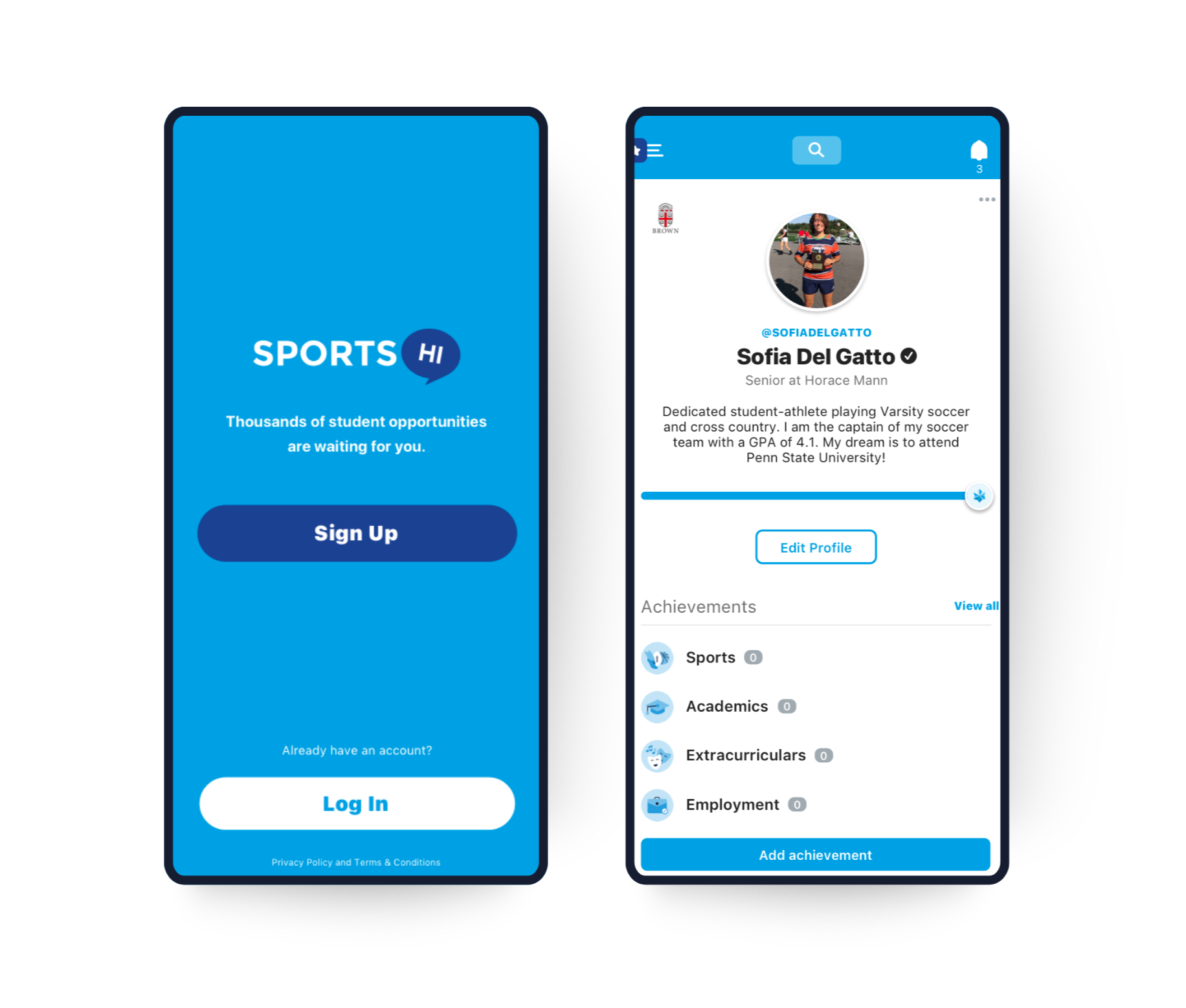
The original app was mainly blue and white with little no to other colors and minimal icon and graphic elements.
PLATFORMS
iOS, Android, Web
From the start of the rebrand I went in and changed the brand colors to allow for a more playful look and feel
AREAS
Strategy, Design
ROLE
Lead Designer
EMPLOYER
Breakthru
APPROACH
The goal was to refresh Breakthru’s brand identity and redesign key app features to increase student engagement, improve usability, and create a more modern, cohesive experience. By introducing gamification, redesigning existing features, and building new ways for students to discover opportunities, we aimed to boost daily active use and support student success while aligning the product with Breakthru’s mission.
PROCESS
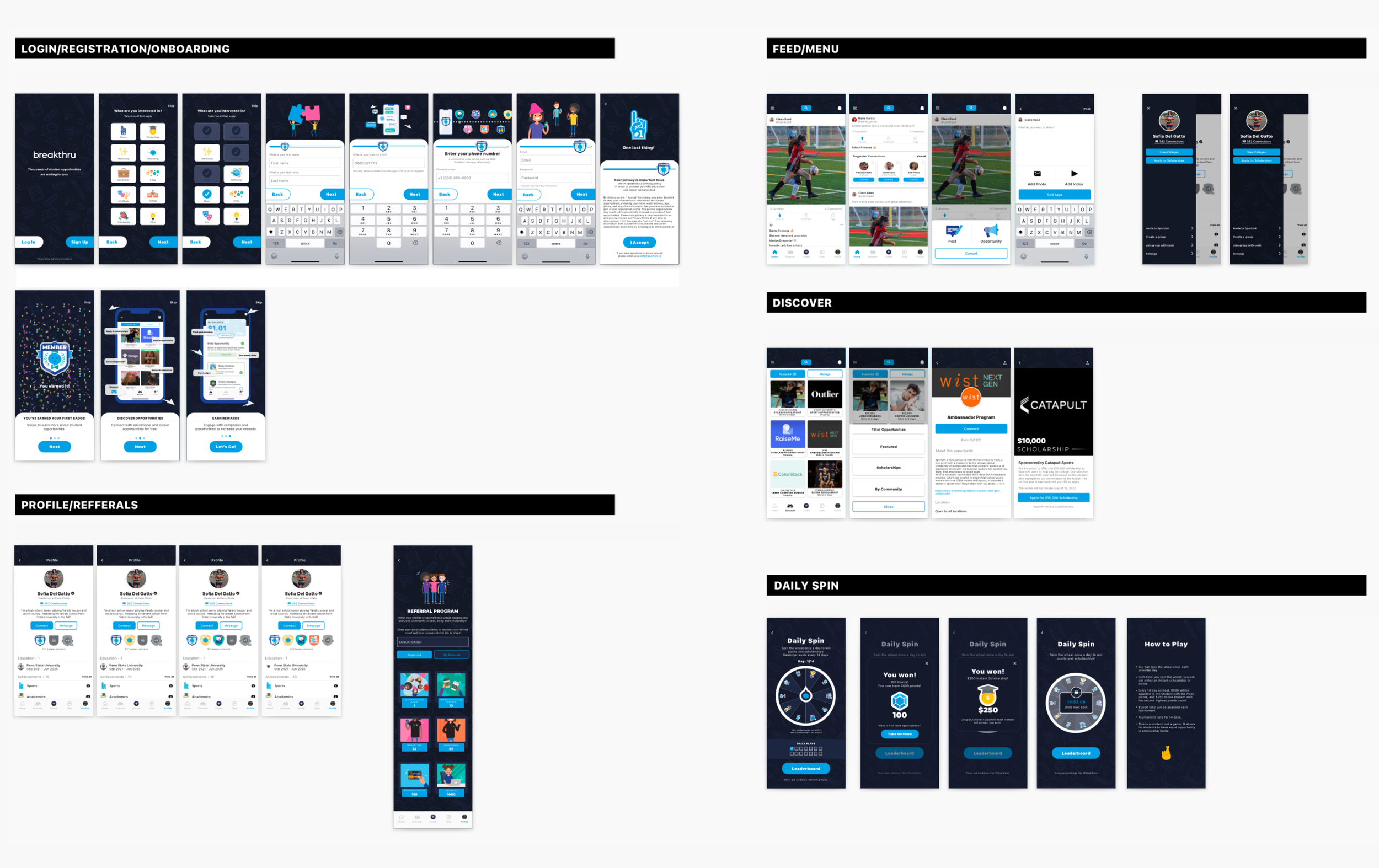
I worked cross-functionally with marketing and leadership to identify pain points and opportunities for improvement. My process included:
Conducting user feedback sessions by attending the internship calls weekly
Mapping user flows and identifying friction points
Creating wireframes, prototypes, and visual design iterations
Collaborating closely with marketing to keep a consistent look, feel, and message for rebrand
BRAND REFRESH
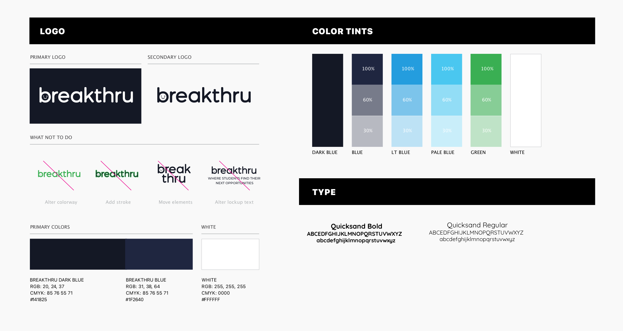
I redesigned the logo, color palette, and brand system to reflect a modern, student-focused identity. I also delivered a comprehensive style guide to ensure visual consistency across the app, marketing materials, and communications.
GAMIFICATION SYSTEM: DESIGNED & IMPLEMENTED
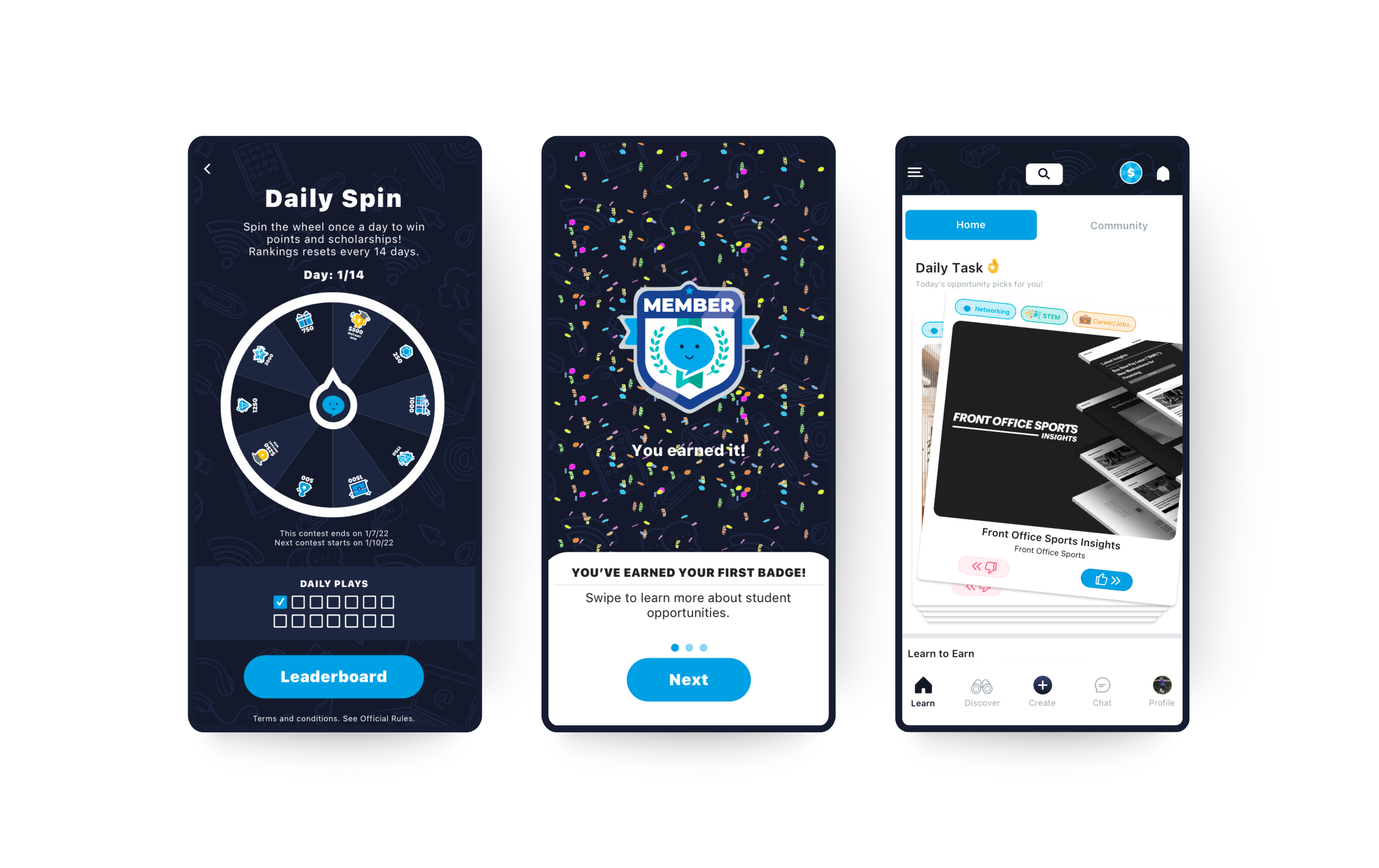
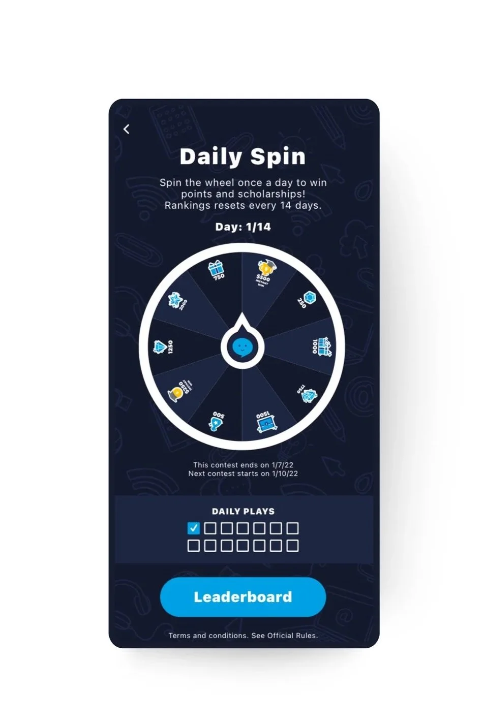
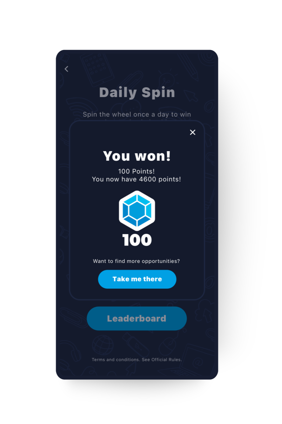
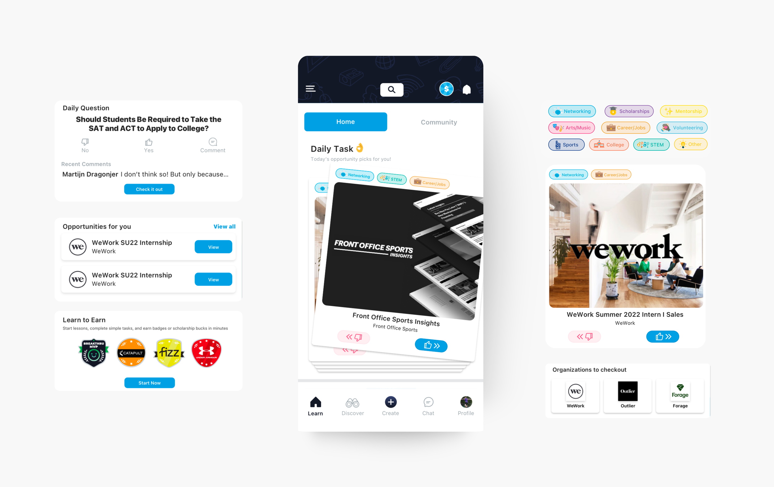
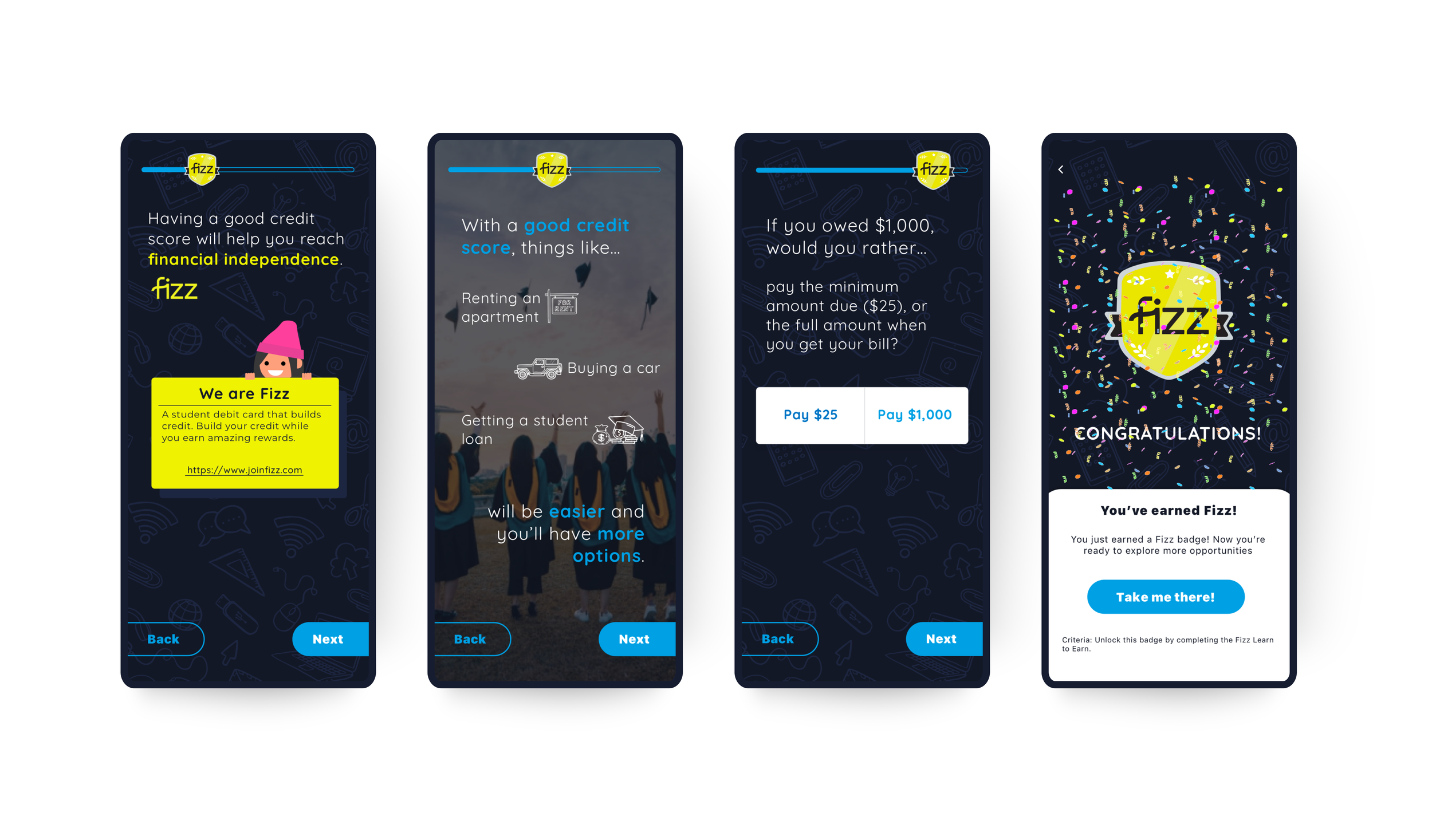
I led the design of Breakthru’s gamification system to boost engagement and retention. This included the Daily Spin, where users could win points and prizes, and a leaderboard that rewarded consistent participation. I designed animated spins and brand-sponsored rewards to make the experience fun and valuable. To deepen engagement, I introduced customizable badges tied to achievements and partnerships, displayed on user profiles with celebratory animations. Building on this, I helped launch the Digital Wallet, allowing users to cash out rewards and enter branded contests. I also redesigned the registration and referral flows to be simpler and more rewarding, and created a swipeable Discover tab to help students explore opportunities in a playful, intuitive way.
IMPACT
The impact was immediate and measurable. Gamification features led to increased user engagement and repeat daily logins. The refreshed brand identity aligned with student expectations and enhanced company credibility. A more intuitive product experience supported student discovery and helped drive program growth.