THE STORY
KEY FEATURES
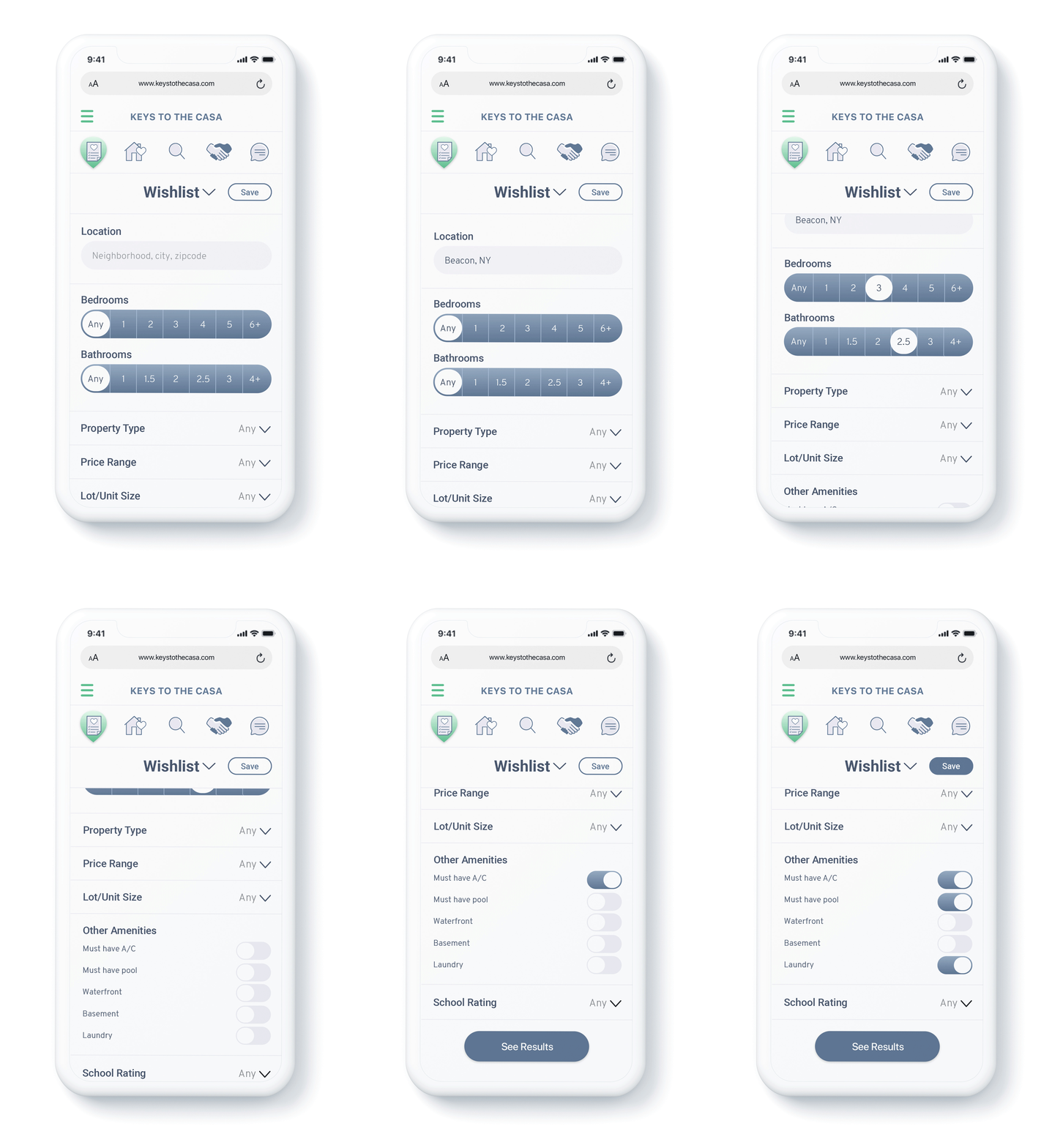
WISHLISTS
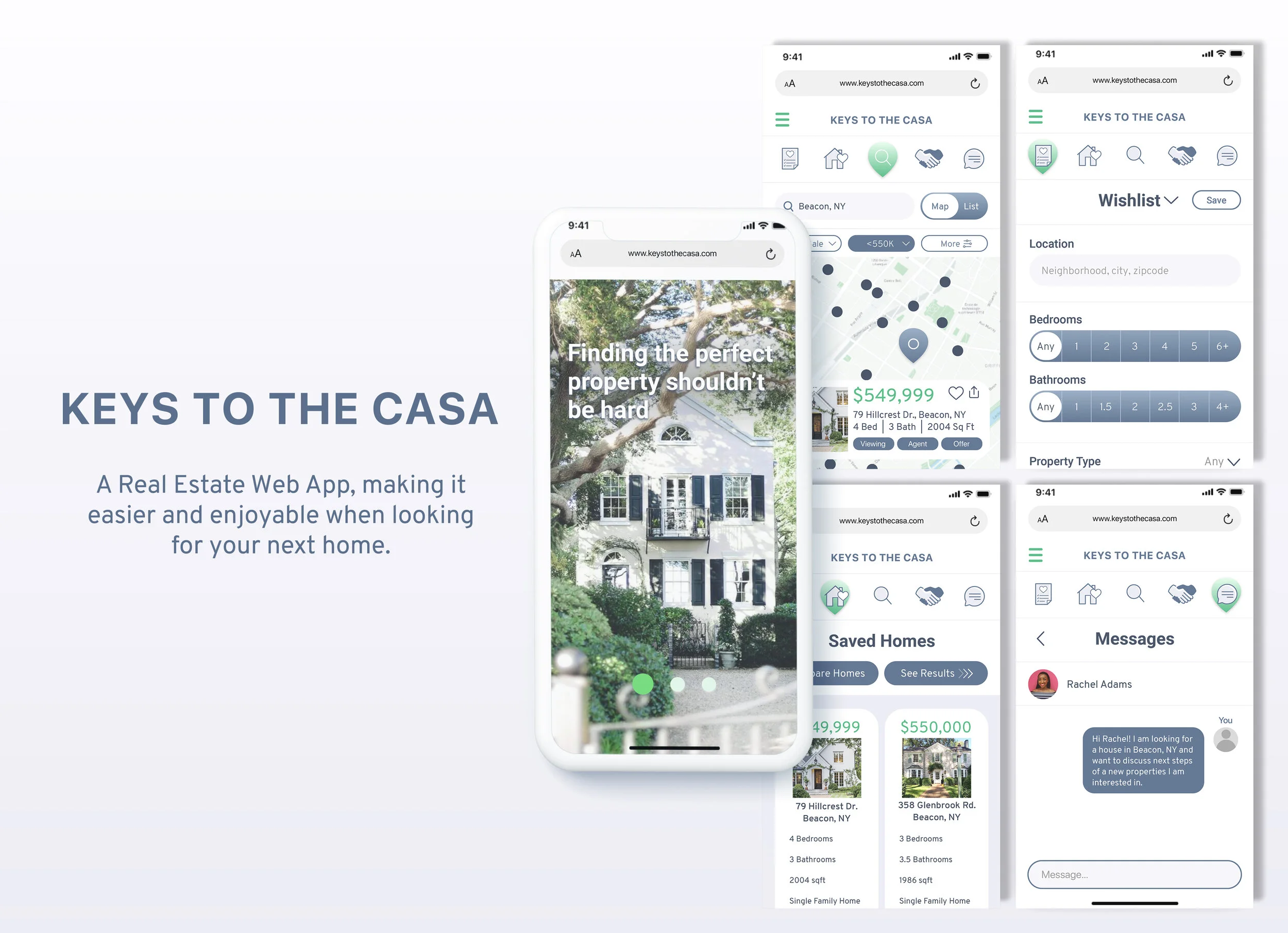
Users can create wishlists that will have their specific criteria for a property. The wishlists will be saved by location where users can always go back to view the same search at any time.
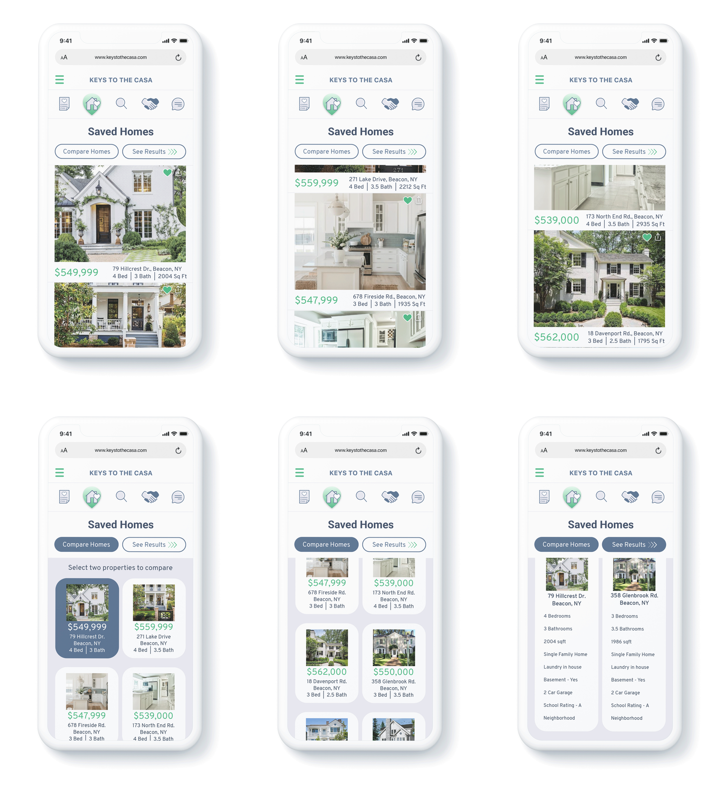
SAVED HOMES
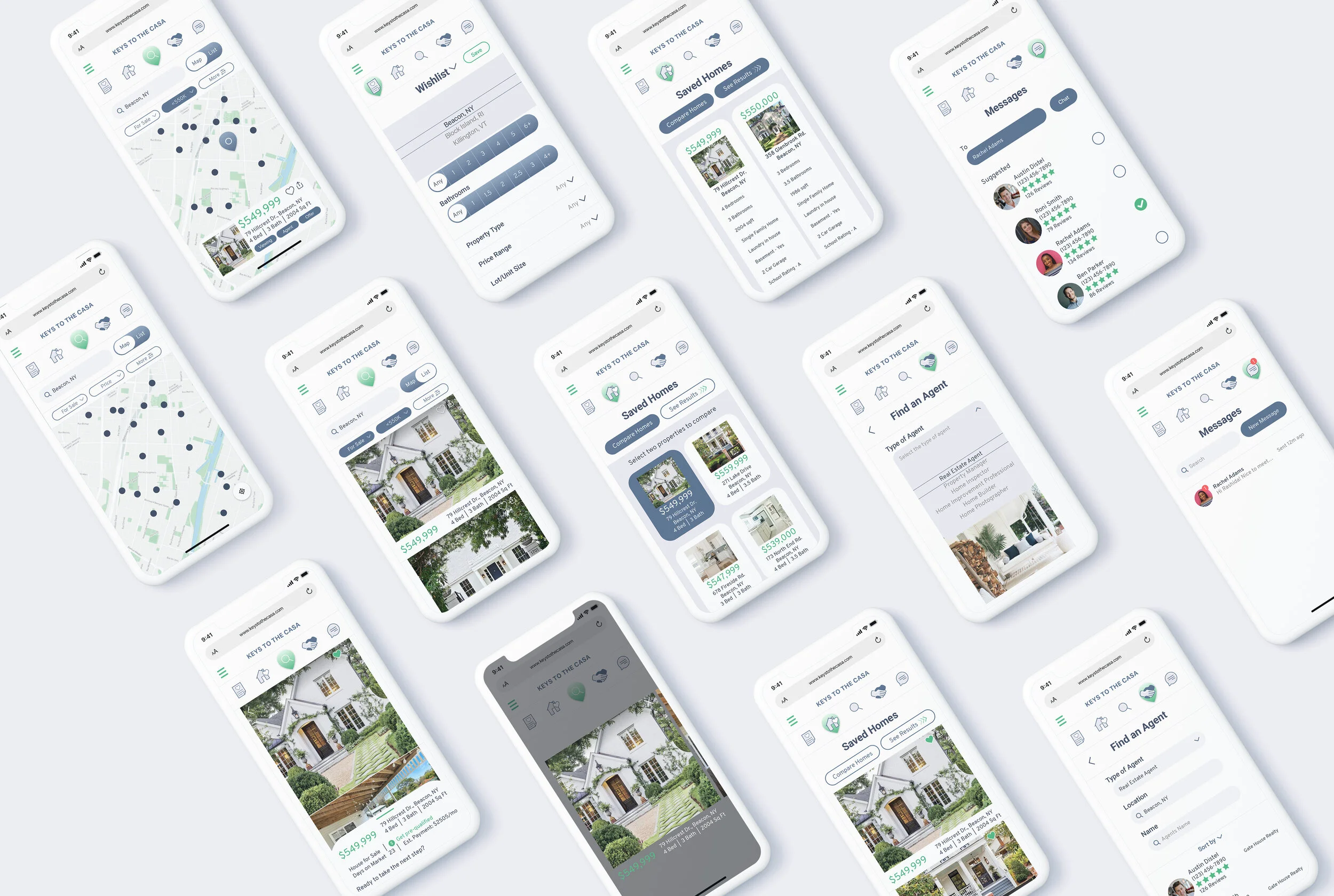
Users will be able to like, save, and share listings. Part of the Saved Homes features allows users to be able to compare properties side by side making the decision making process easier.
FIND AN AGENT
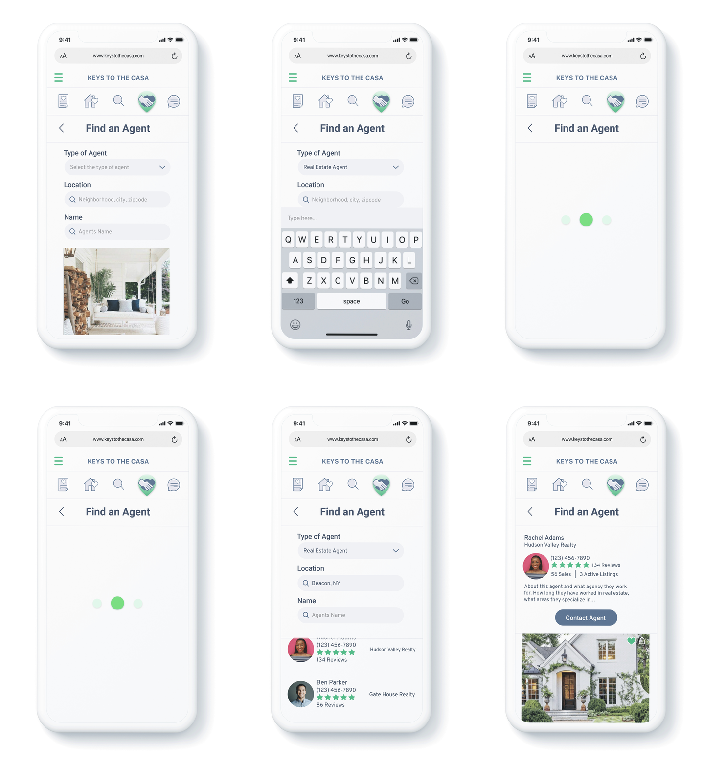
Users will be able to find the perfect agent for them and what they need. They will be able to see agents profiles with reviews and a short bio. The types of agents they can look for are:
Real Estate Agent
Property Manager
Home Inspector
Home Improvement Professional
Home Builder
Home Photographer
MOODBOARD
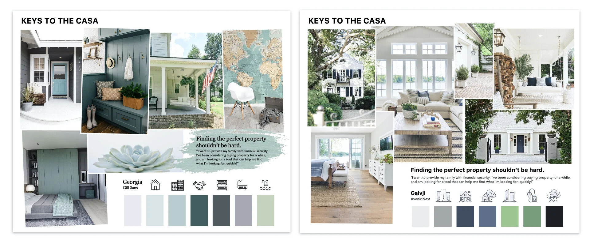
Created two options for visual direction once lo-fidelity wireframes were completed.
Based on the rough branding guidelines or “quick, clean, and smart” using greens and blues, I created the above two moodboards.
Even though both moodboards give the feeling and provoke the emotions of calmness and relaxation, I ultimately went with the moodboard on the right. It has a more sophisticated color palette as well as fitting in better with the persona and their needs.
CUSTOM ICONS & BRANDING
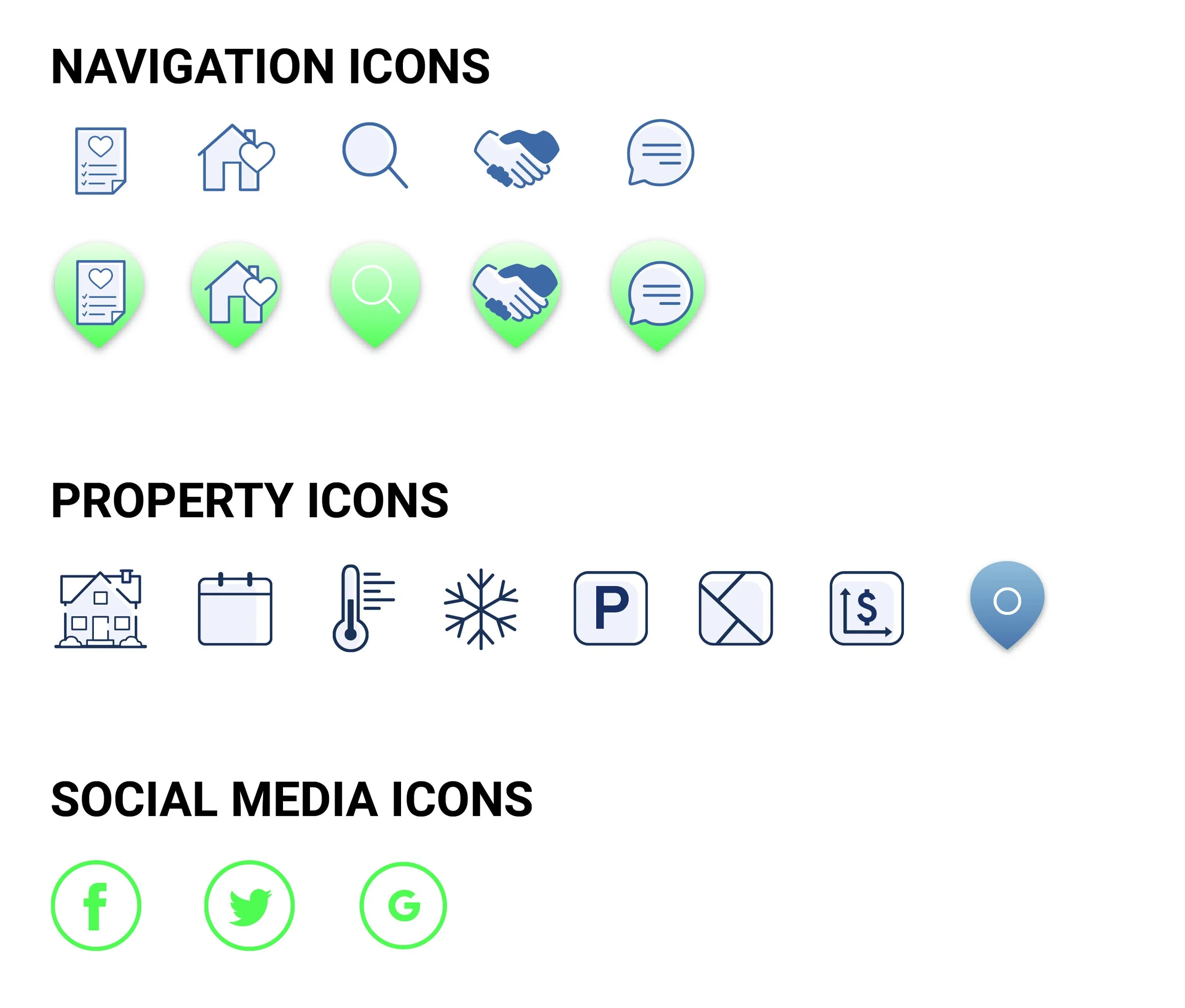
Custom icons and illustrations further created the mood and feeling Keys to the Casa wants to create for users.
Check out the complete Style Guide for this project here.
RESPONSIVE DESIGN
By keeping with the process of Mobile First Design, it allowed me to easily adapt my mobile wireframes into tablet and desktop forms. It also allowed me to utilize the space when on a larger screen.
The only issue I faced in the beginning was having the mobile navigation bar on the bottom of the screens, but once I thought about this being a responsive web app, I knew it would be a cleaner transition to move it to the top.
CONCLUSION
This project allowed me to have a stronger understand of responsive web apps and how to adapt within the different sizes of screens. My biggest challenge was to differentiate this web app from the other real estate tools, such as Zillow. By have clear features that other real estate apps do not offer and with pushing my creativity through color, icons, and imagery, I was able to come up with Keys to the Casa.
I think the most important thing I learned from doing this project was to always refer back to not only the user persona, but also the moodboard. Having a clear moodboard and concept allowed me to make design decisions much more easily.
